The Cooper Union:
Intra-Disciplinary Seminar
BRANDING,
MOTION GRAPHICS,
WEB DESIGN
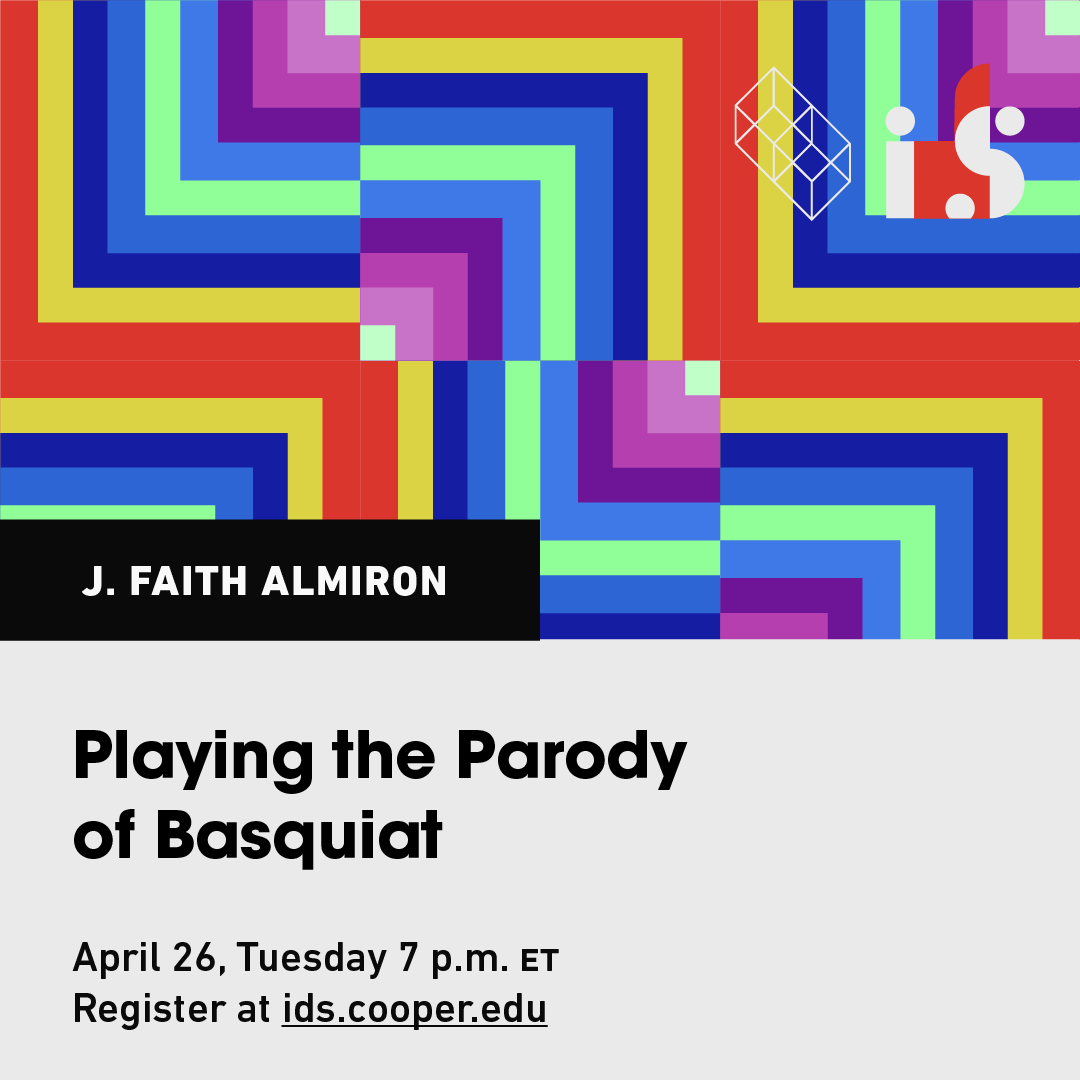
The brand identity for the IDS lecture series refreshes every year. For its fifth edition, we combined a modular symbol — a gradated square — and an expansive color palette to create a dynamic visual identity that reflects its ever-changing nature and depicts the meshing of inter-and-intra-disciplinary approaches to art.
︎︎︎

We designed the logo as an extension of the modular square. It is both the base for the lowercase “D” and the central element of the letter-mark. By opting for lowercase glyphs versus uppercase, as is traditionally used for acronyms, we created a balance between rounded and sharp edges. These playful but refined contrasts are further echoed by our primary typeface Avant Garde.
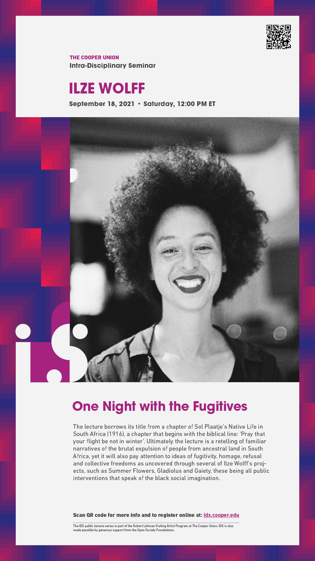
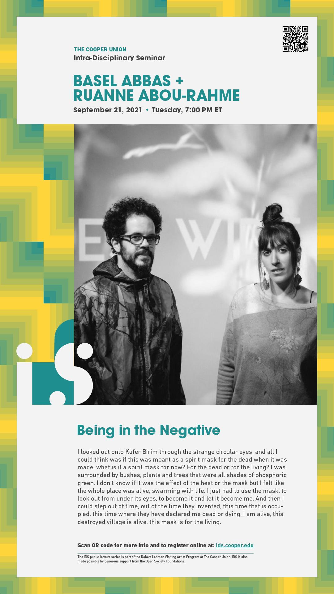
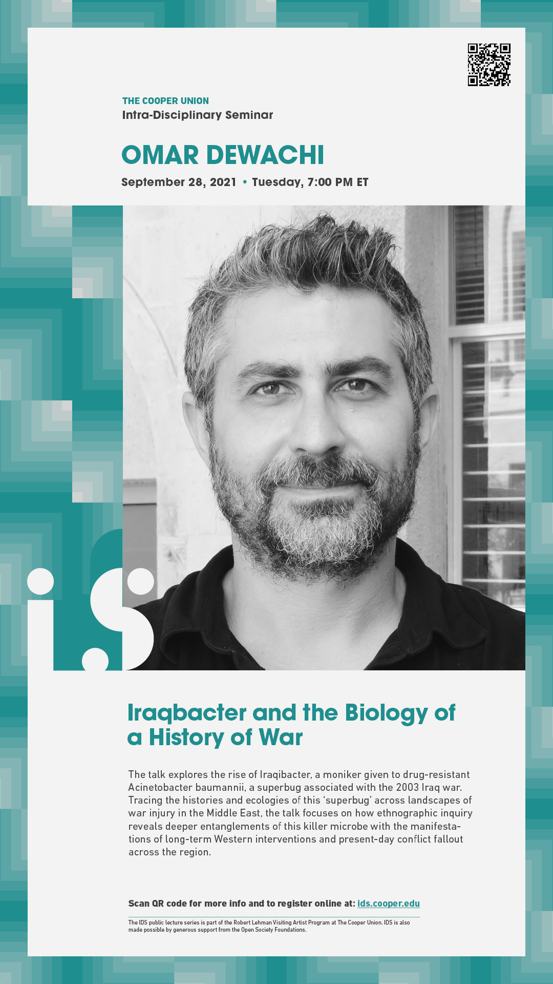
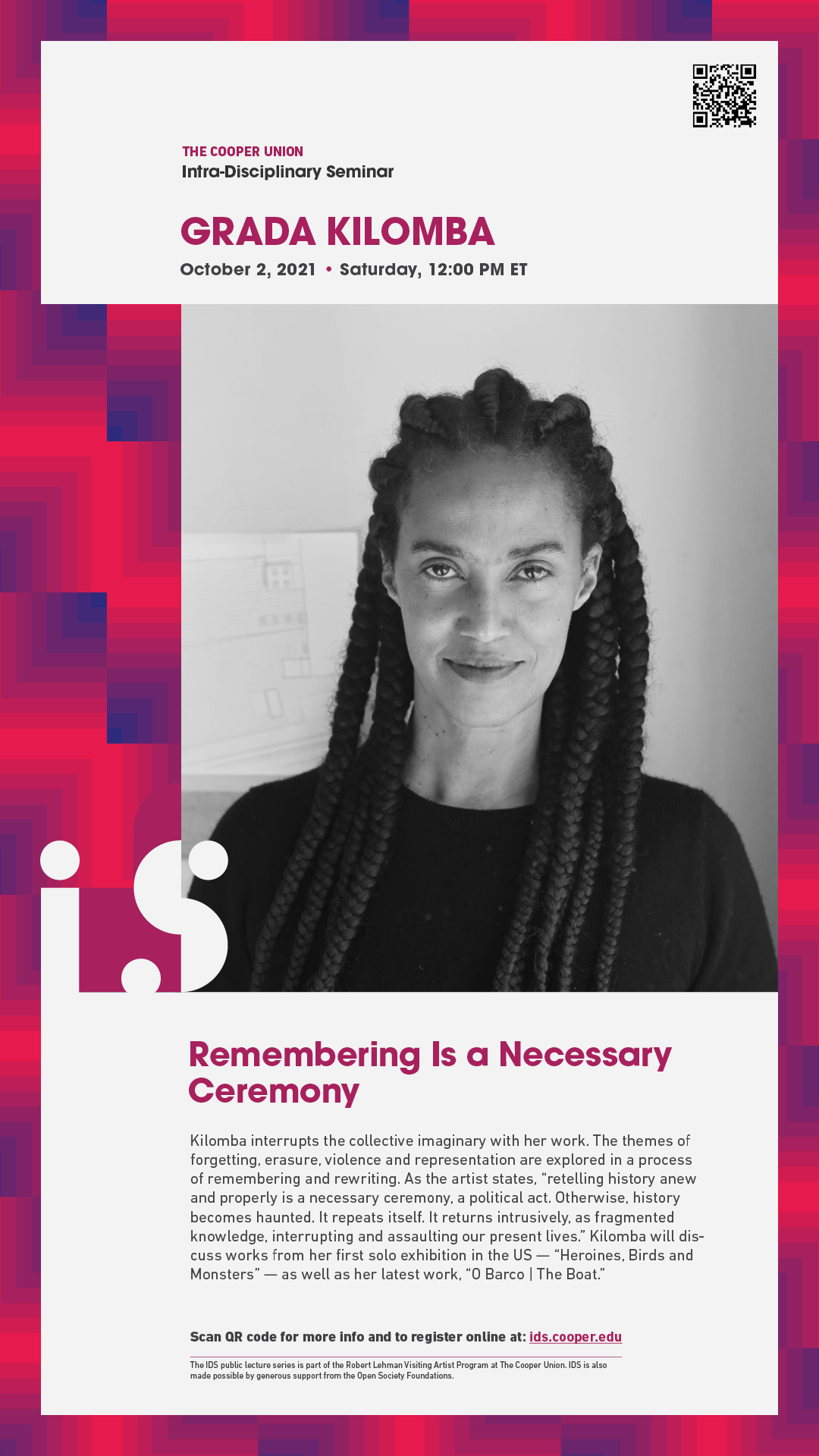
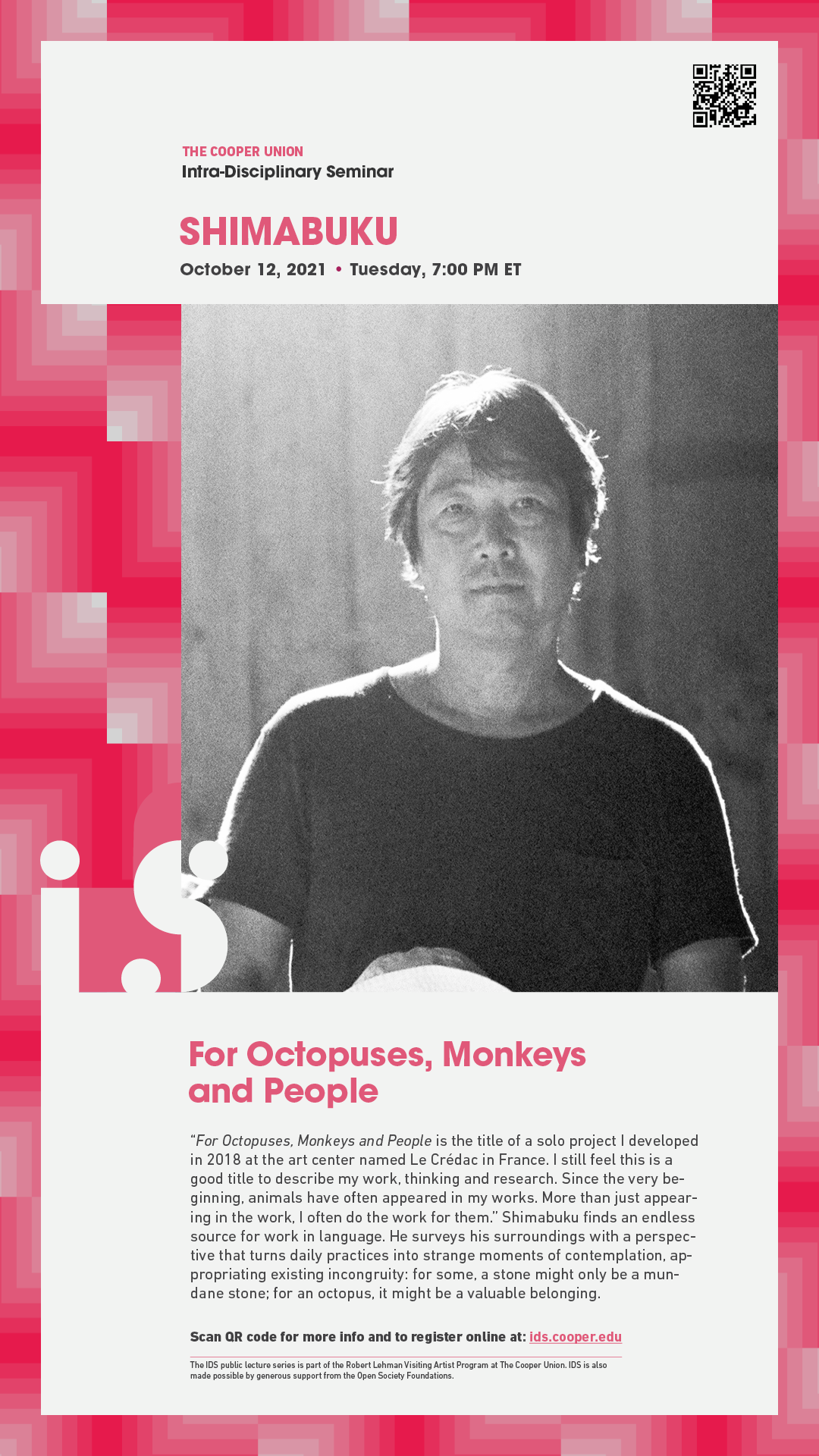
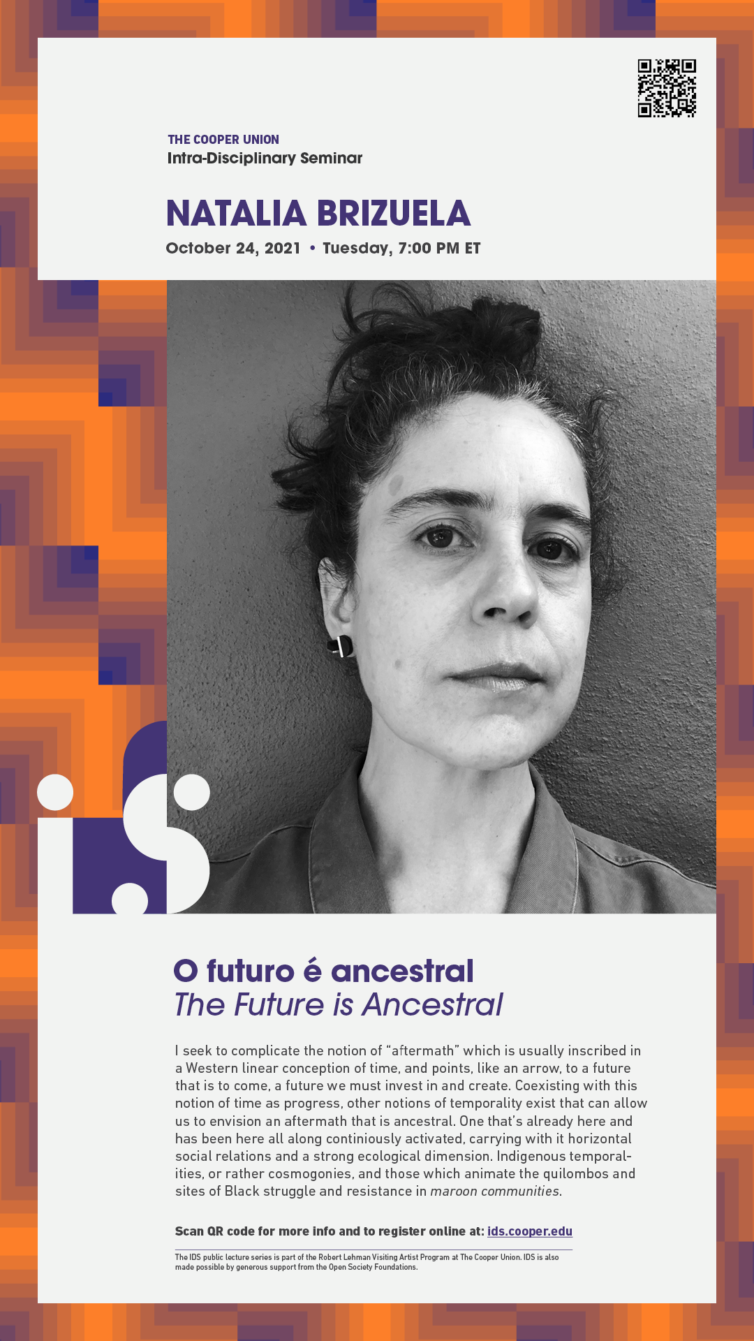
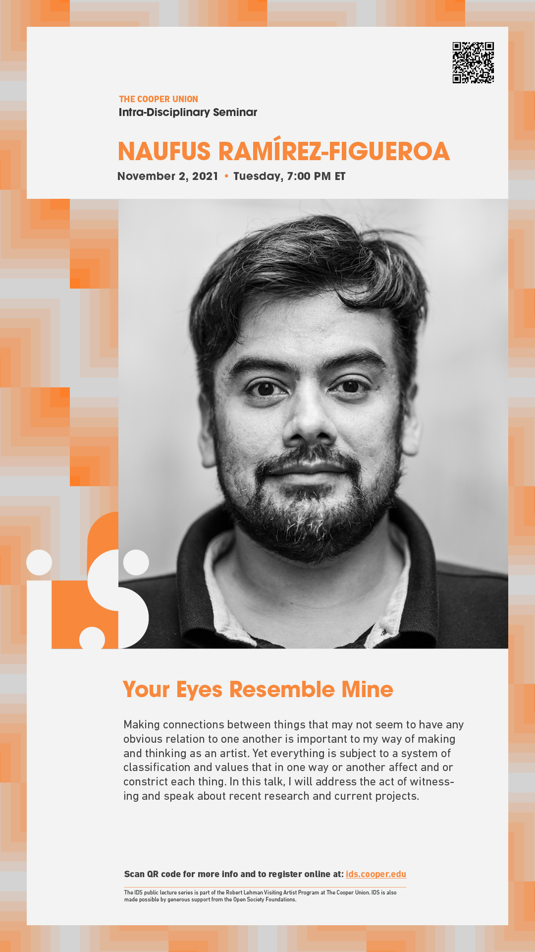
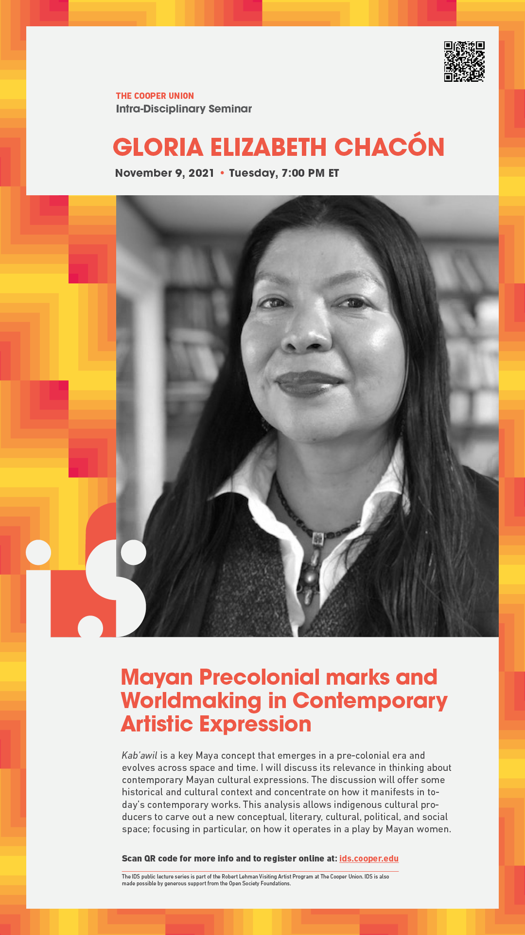
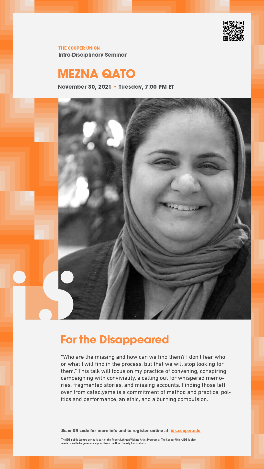
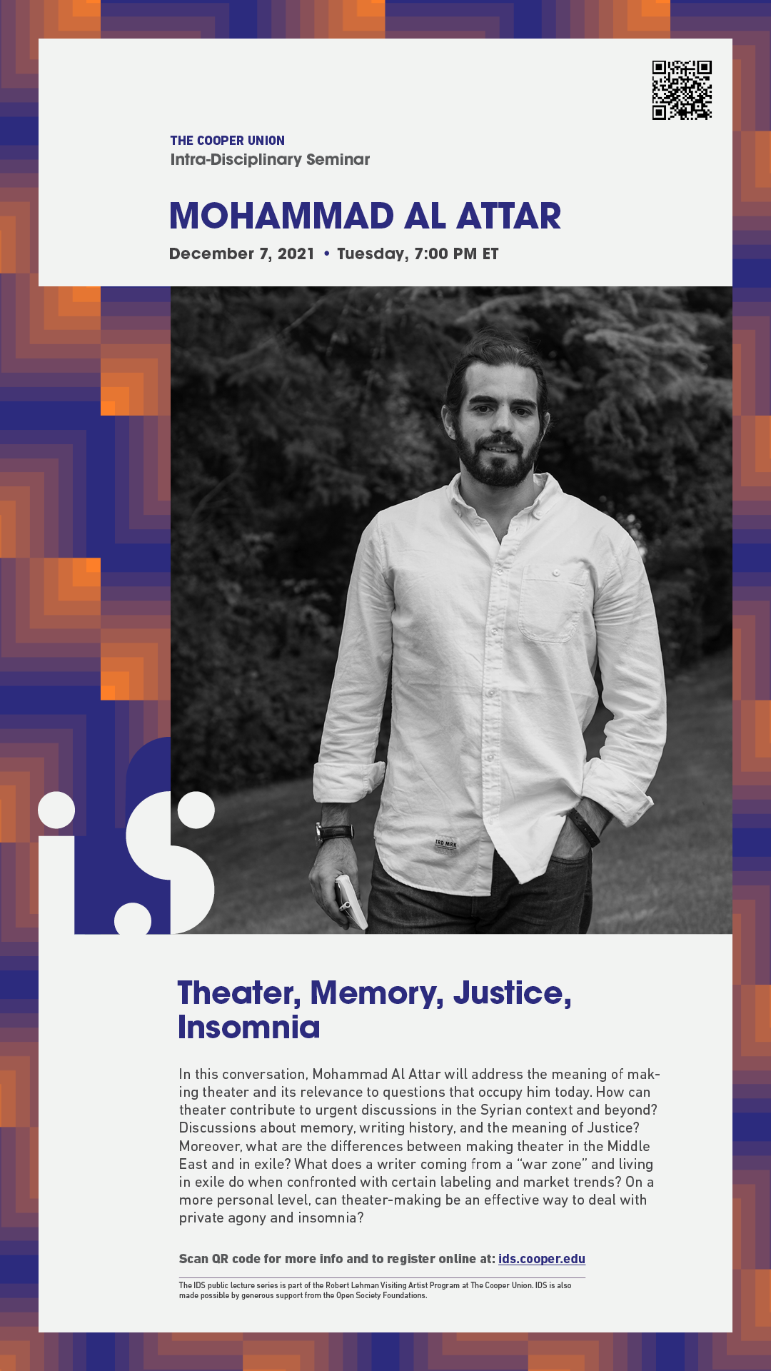
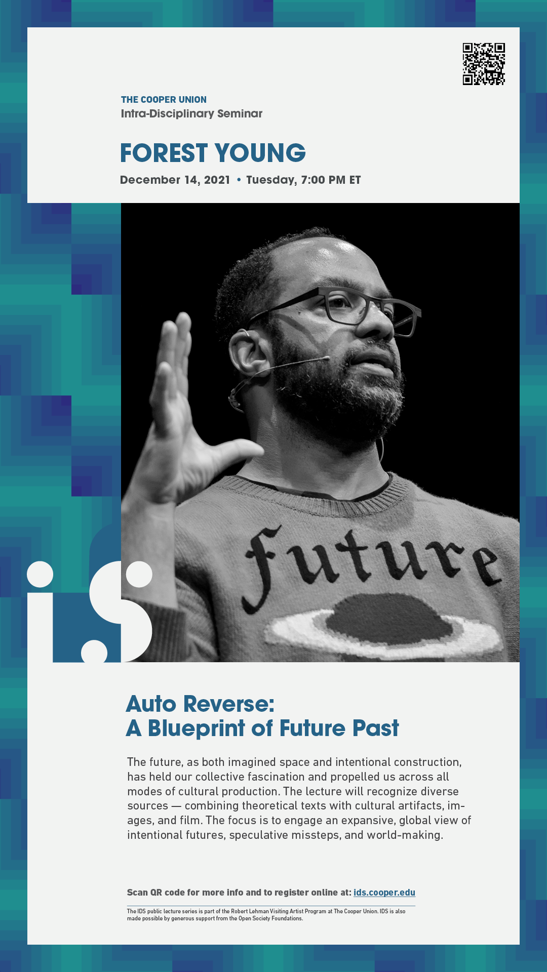
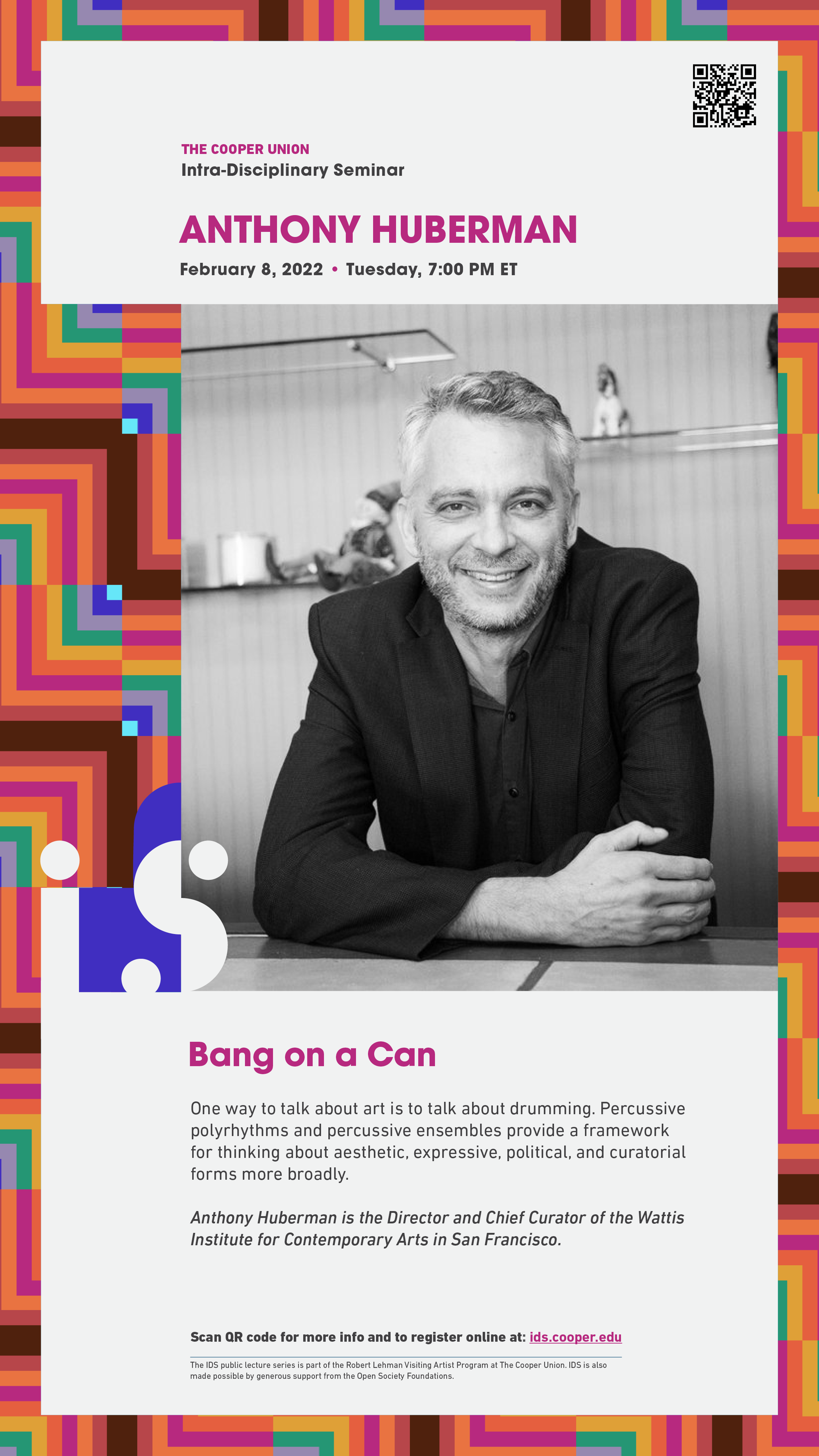
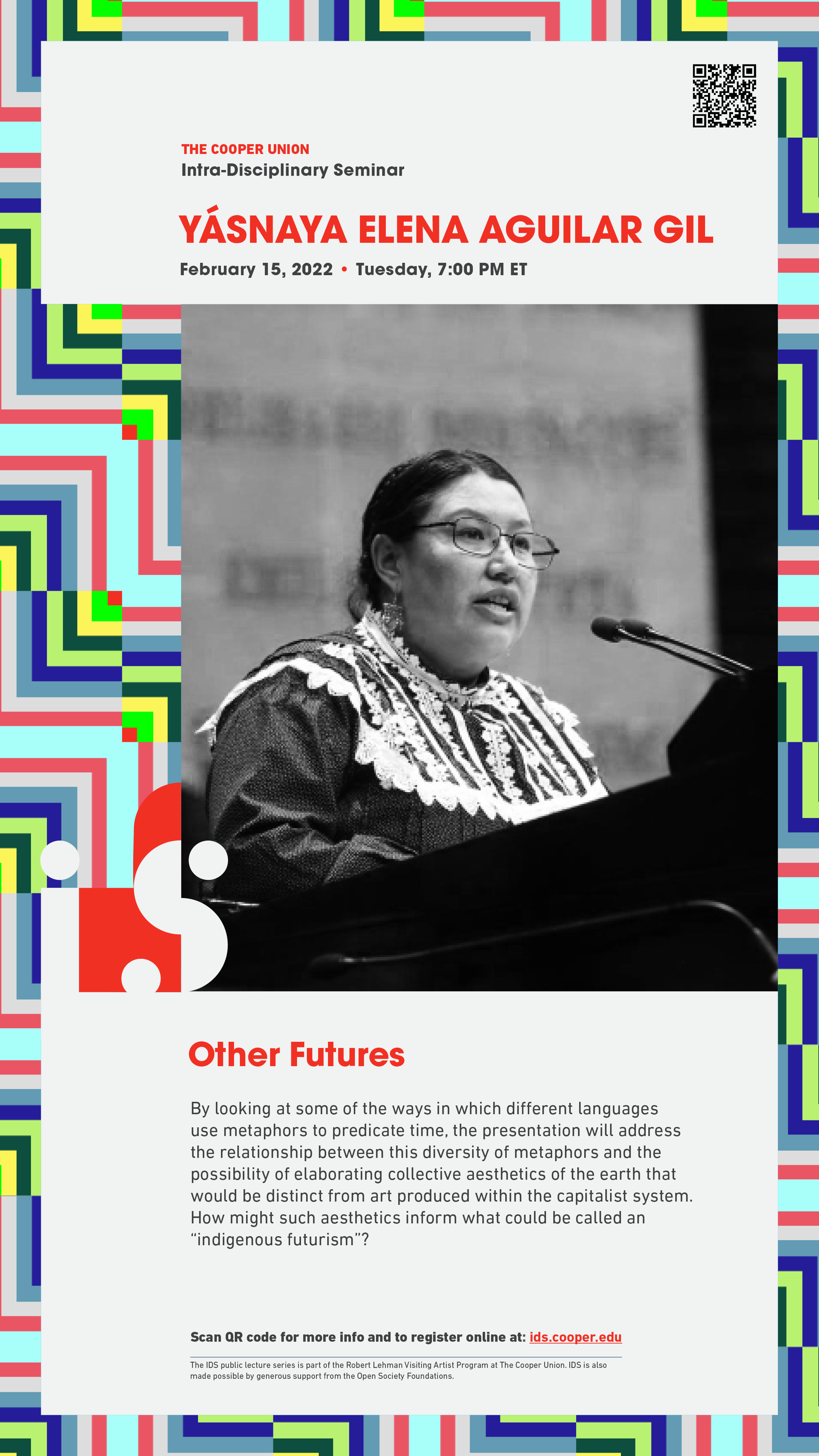
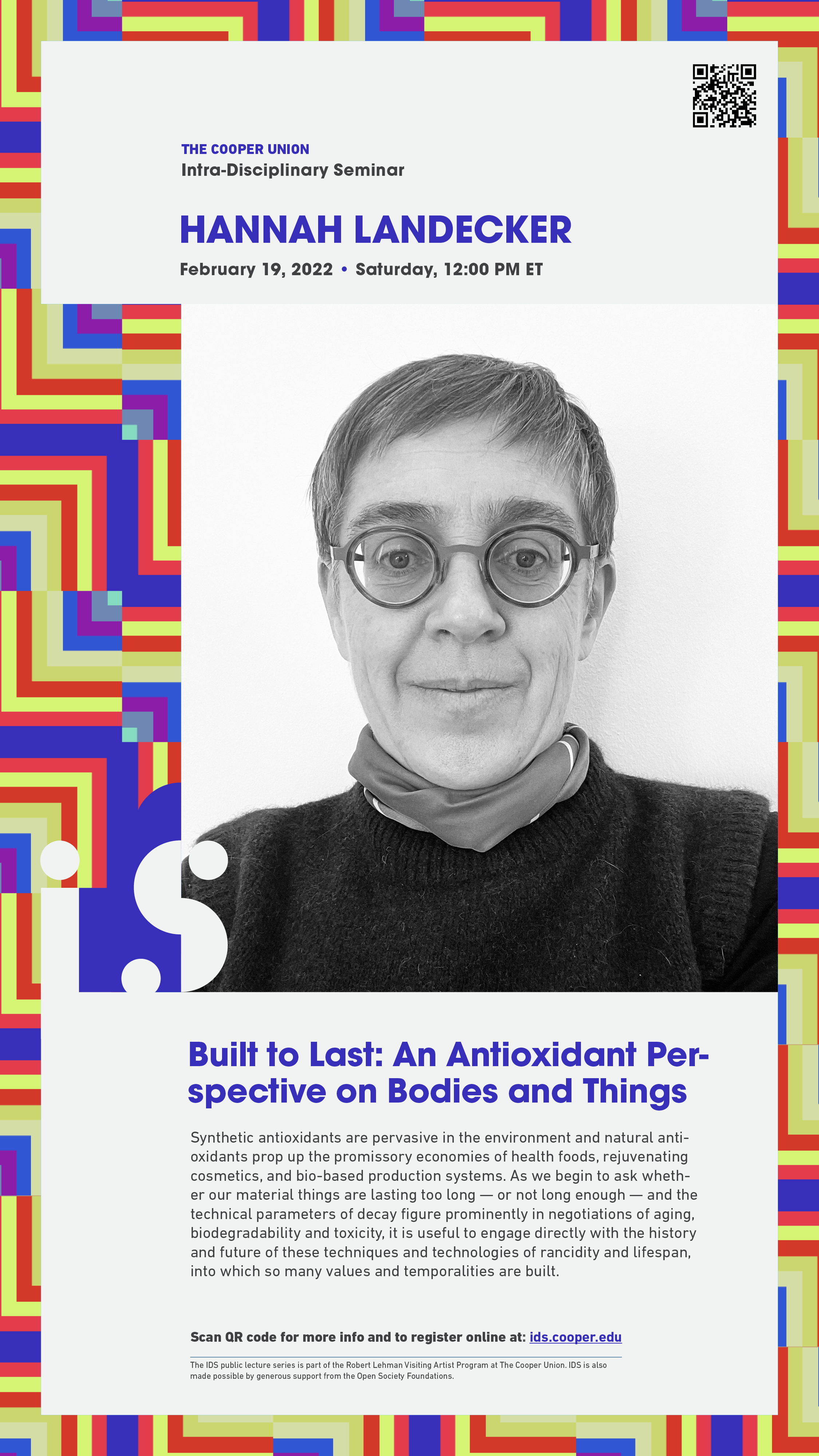
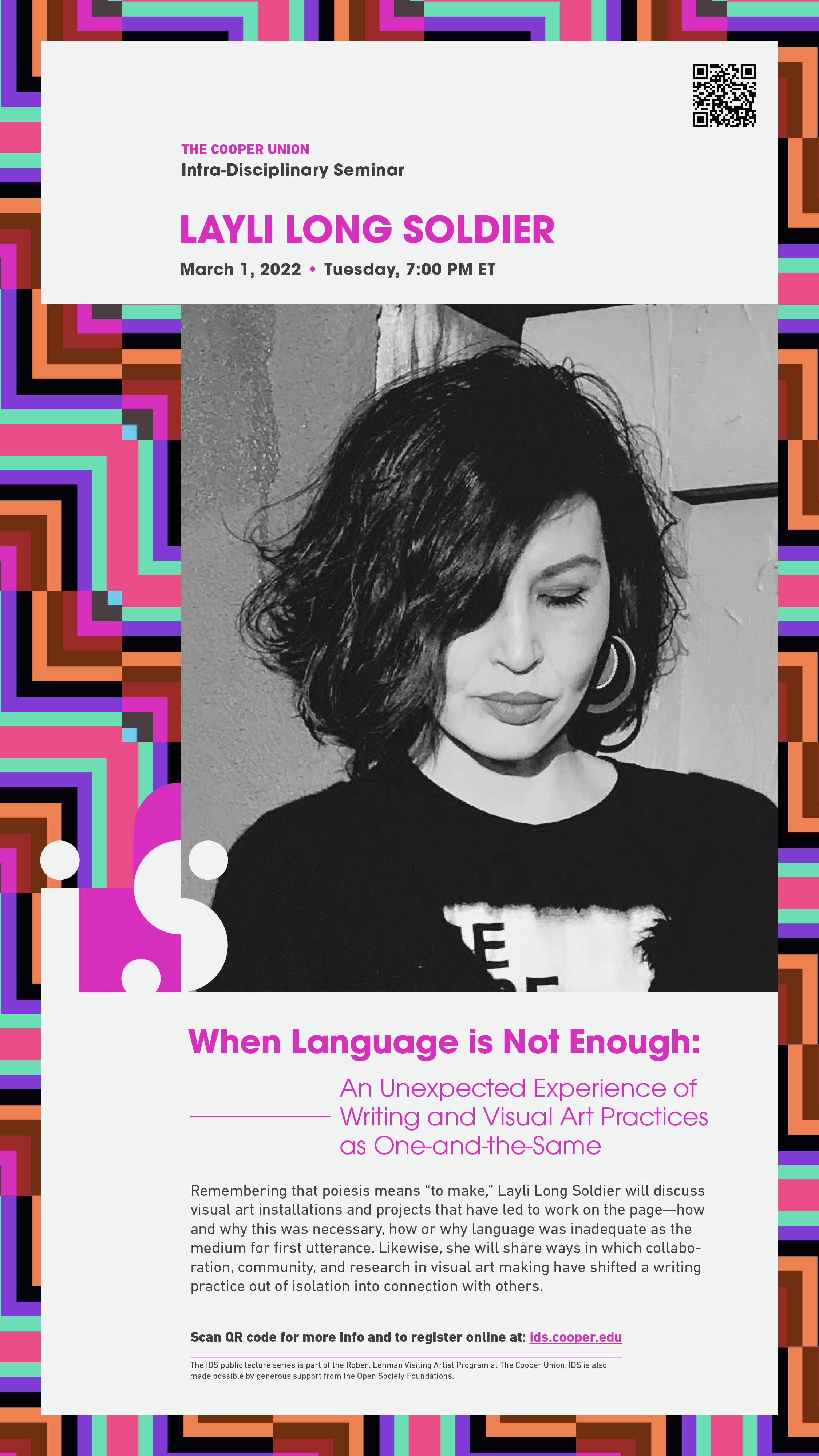
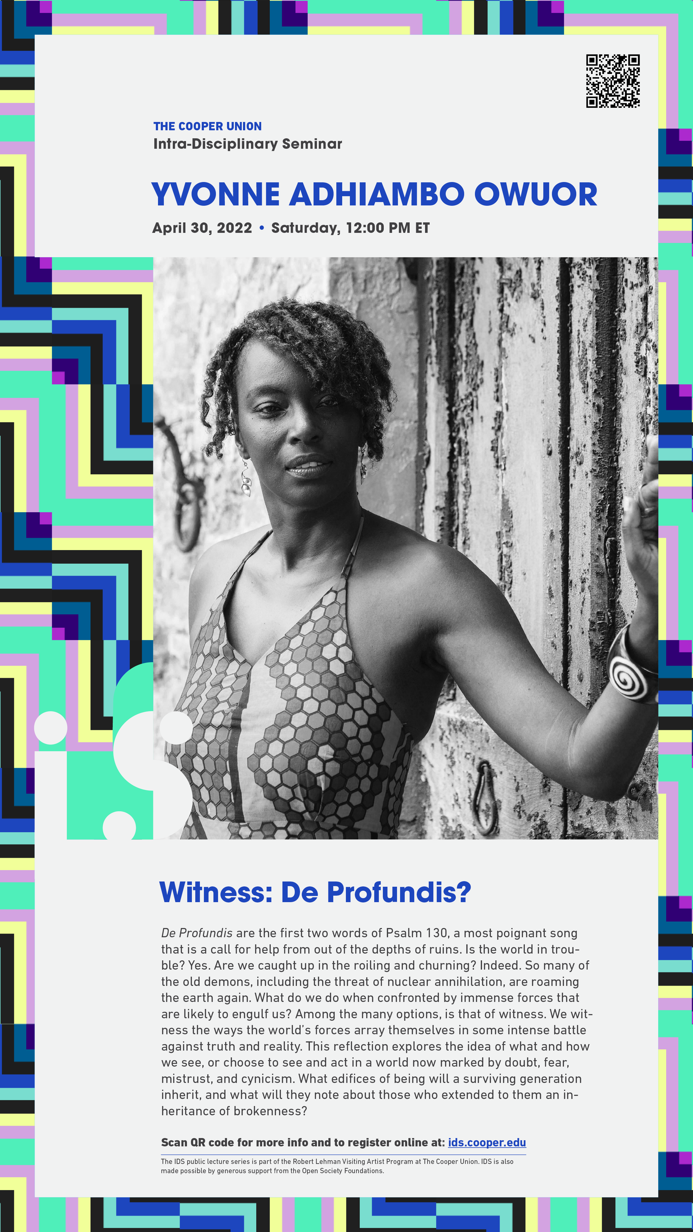
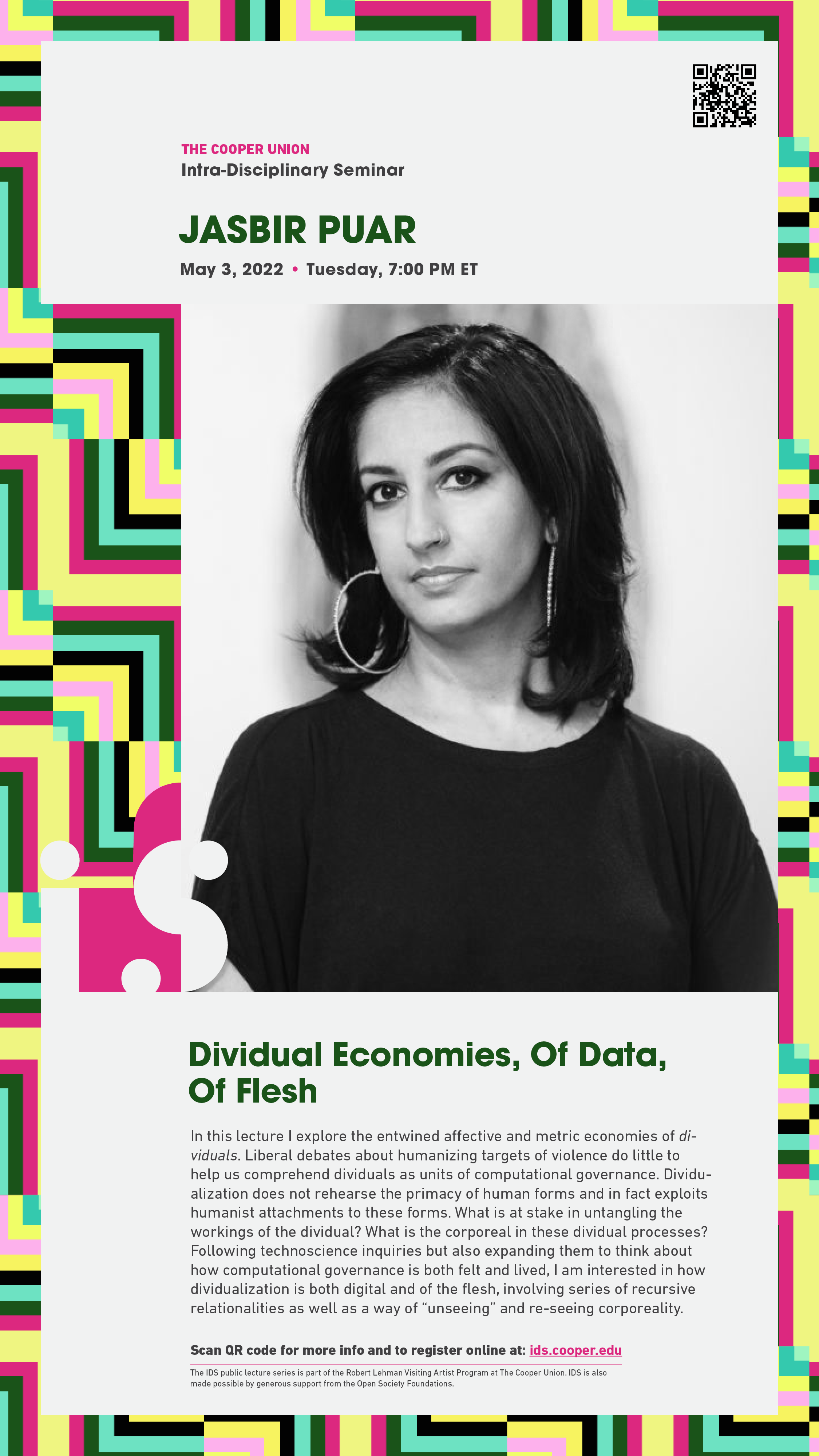
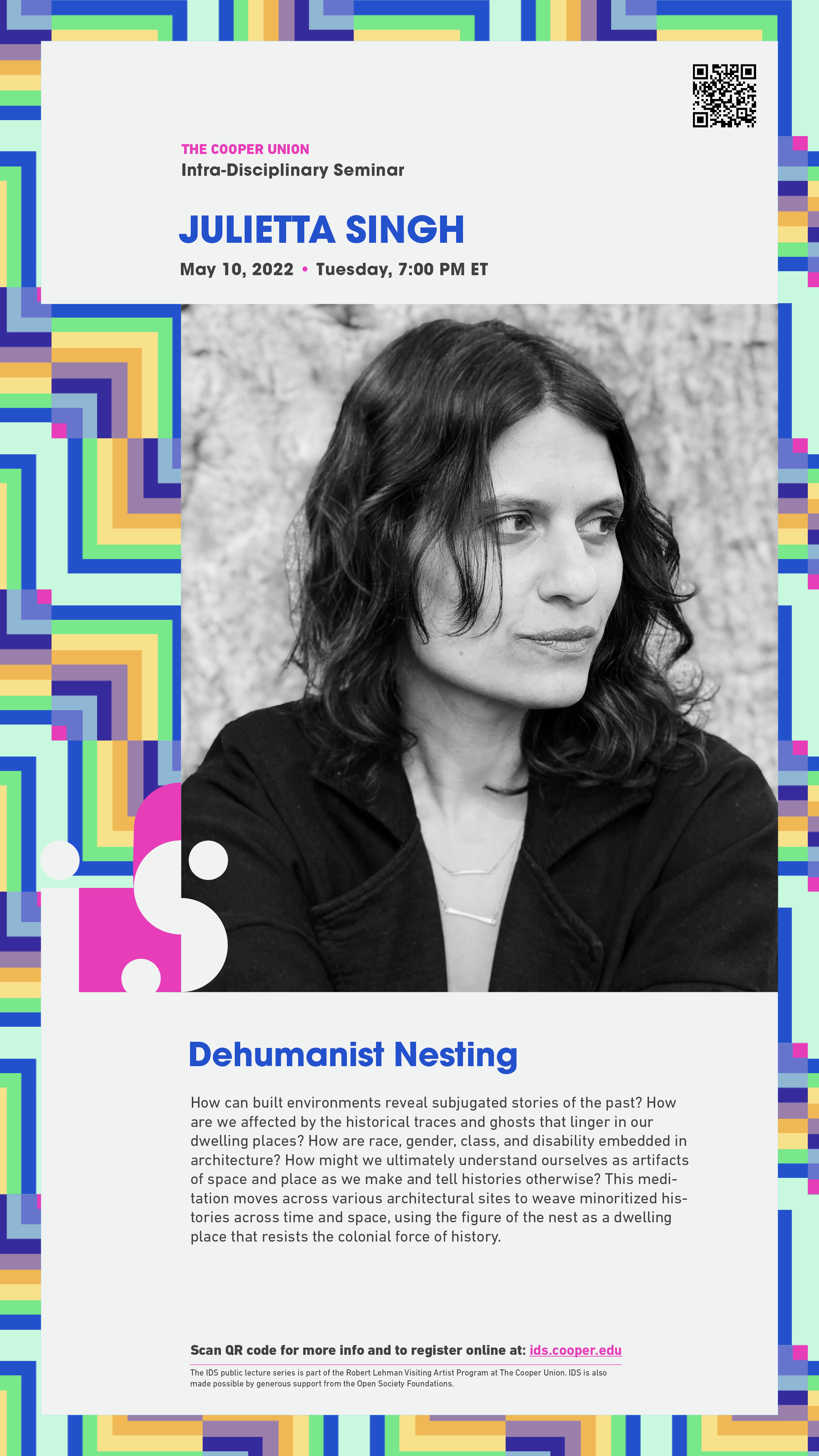
We opted for a limited color palette for the launch of the Fall 2021 program. Speakers whose practices overlapped in either form or function were assigned similar gradients within the palette, highlighting the macro relationships between them. For the Spring launch, however, we unleashed the full extent of our modularity and randomized the colors of every foundational cell through a code built into the website. These individual palettes were later refined to represent how every individual speaker brings their own set of harmonies and contradictions into the inter-disciplinary space through their own micro viewpoint.
We opted for a limited color palette for the launch of the Fall 2021 program. Speakers whose practices overlapped in either form or function were assigned similar gradients within the palette, highlighting the macro relationships between them. For the Spring launch, however, we unleashed the full extent of our modularity and randomized the colors of every foundational cell through a code built into the website. These individual palettes were later refined to represent how every individual speaker brings their own set of harmonies and contradictions into the inter-disciplinary space through their own micro viewpoint.
︎︎︎ Kiosk Posters


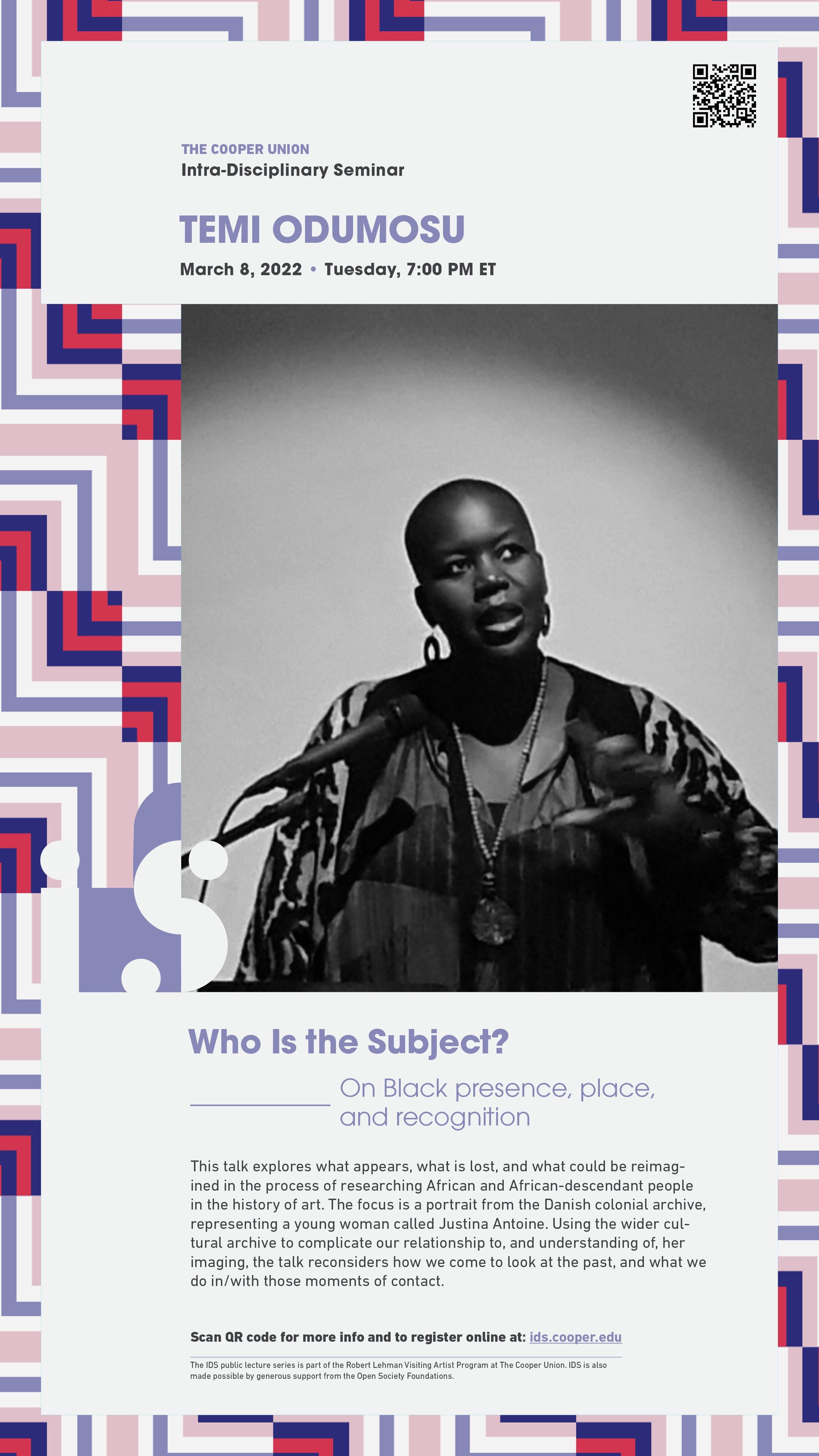
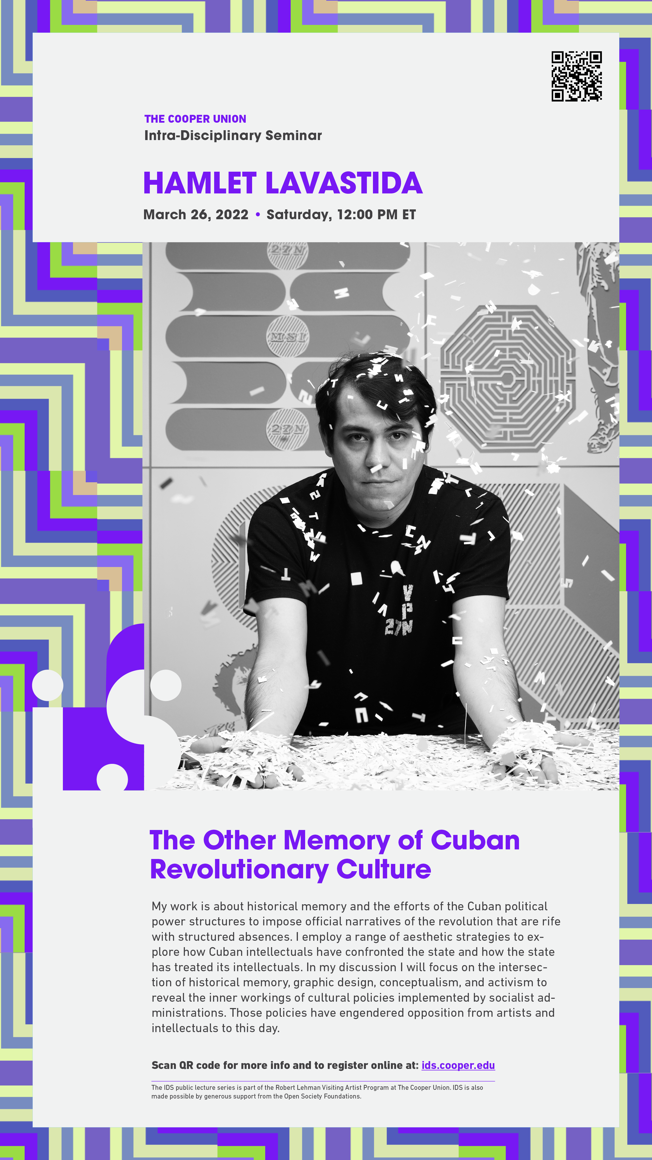

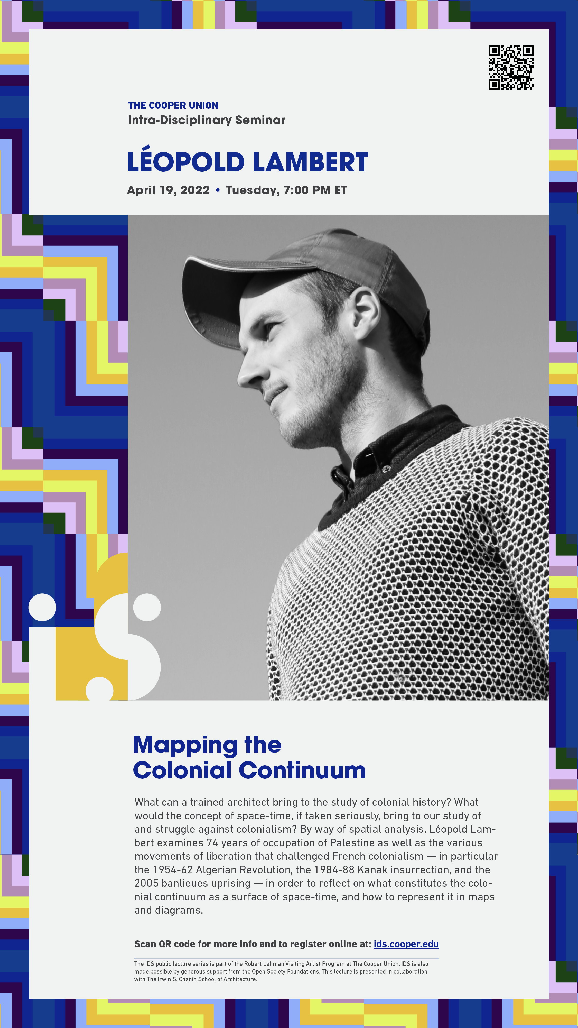
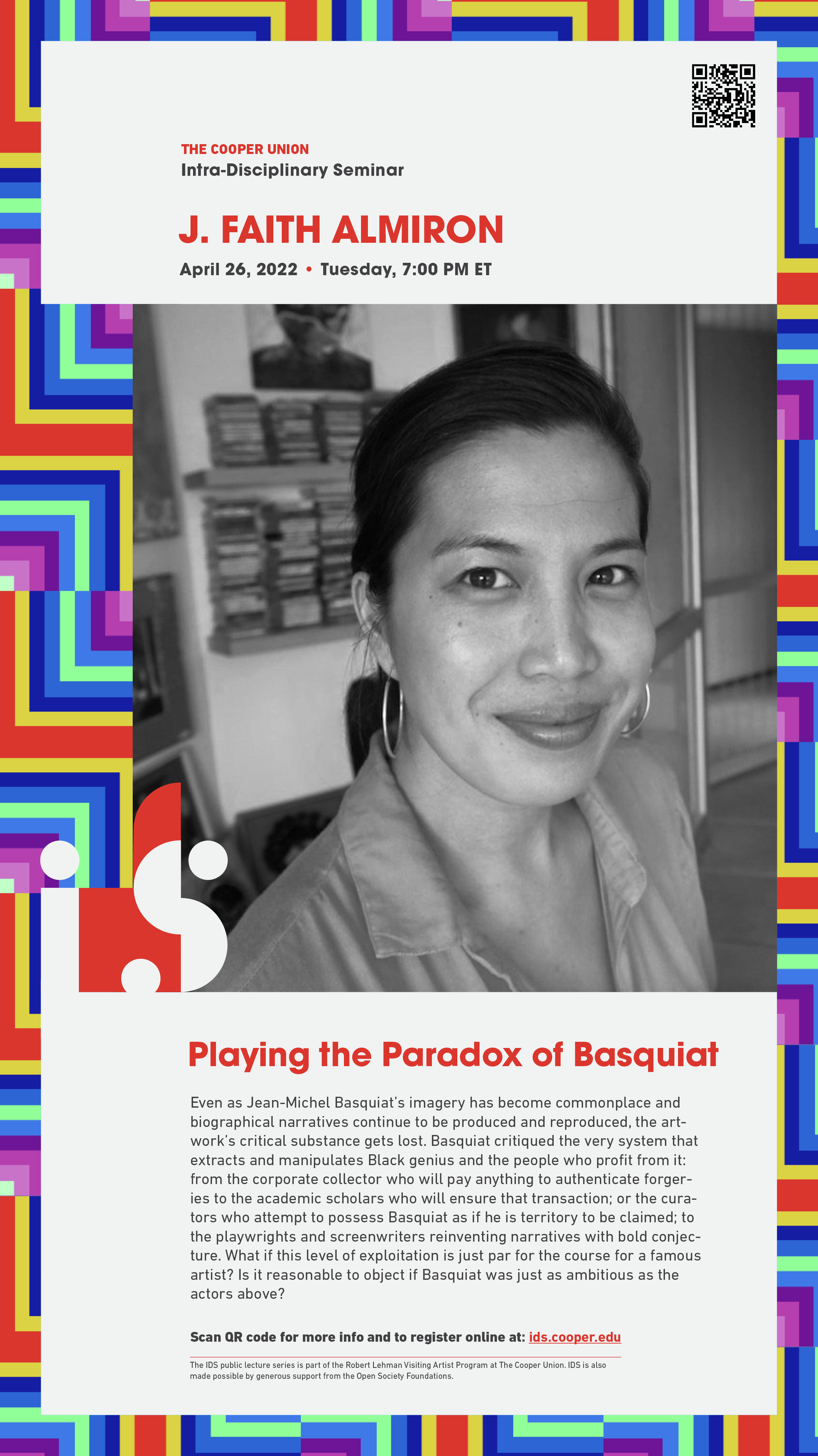
︎︎︎ Social Media


