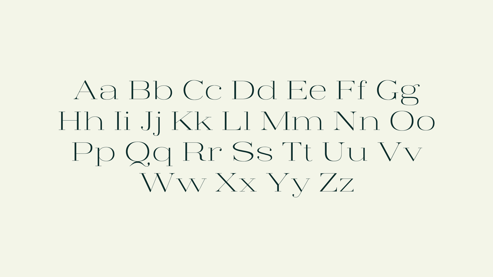
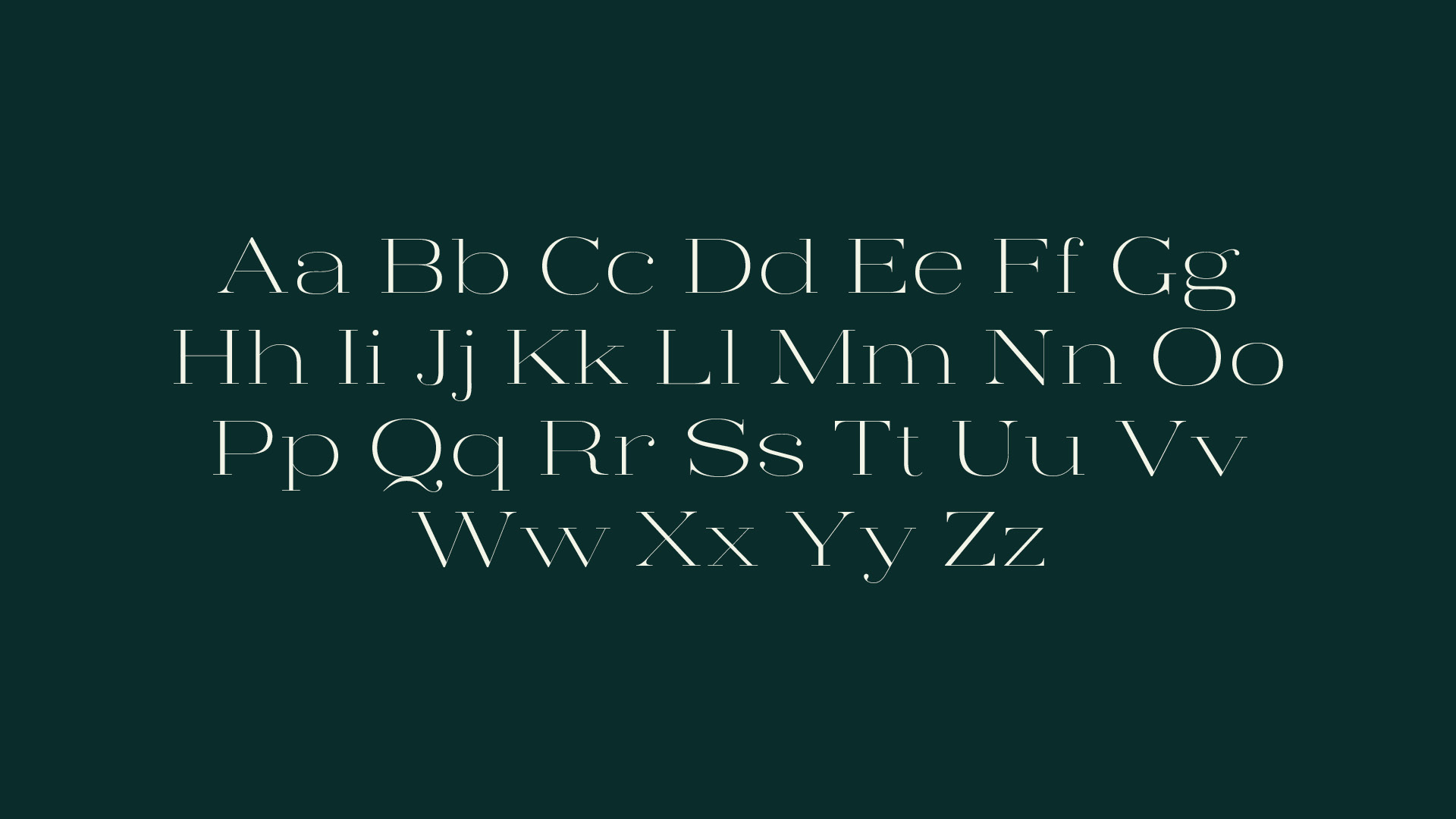
Contra Light
In designing Contra Light, I was drawn to the challenge of creating a serif that was wider than most in my font book but still retained the elegance and delicacy of glass. In this first incursion into type design, I held steadfast to the expansion model, carefully balancing hairline widths with thicker strokes. Named after the latin root contra — meaning “against; opposite; contrasting” — high-contrast was always the goal, placing sharp stems opposite soft curvatures.
The design of Contra Light is ongoing. My attention has shifted to drawing numbers and special characters to round out and refine Contra Light and, in time, to producing heavier weights to expand the Contra family.