Contra
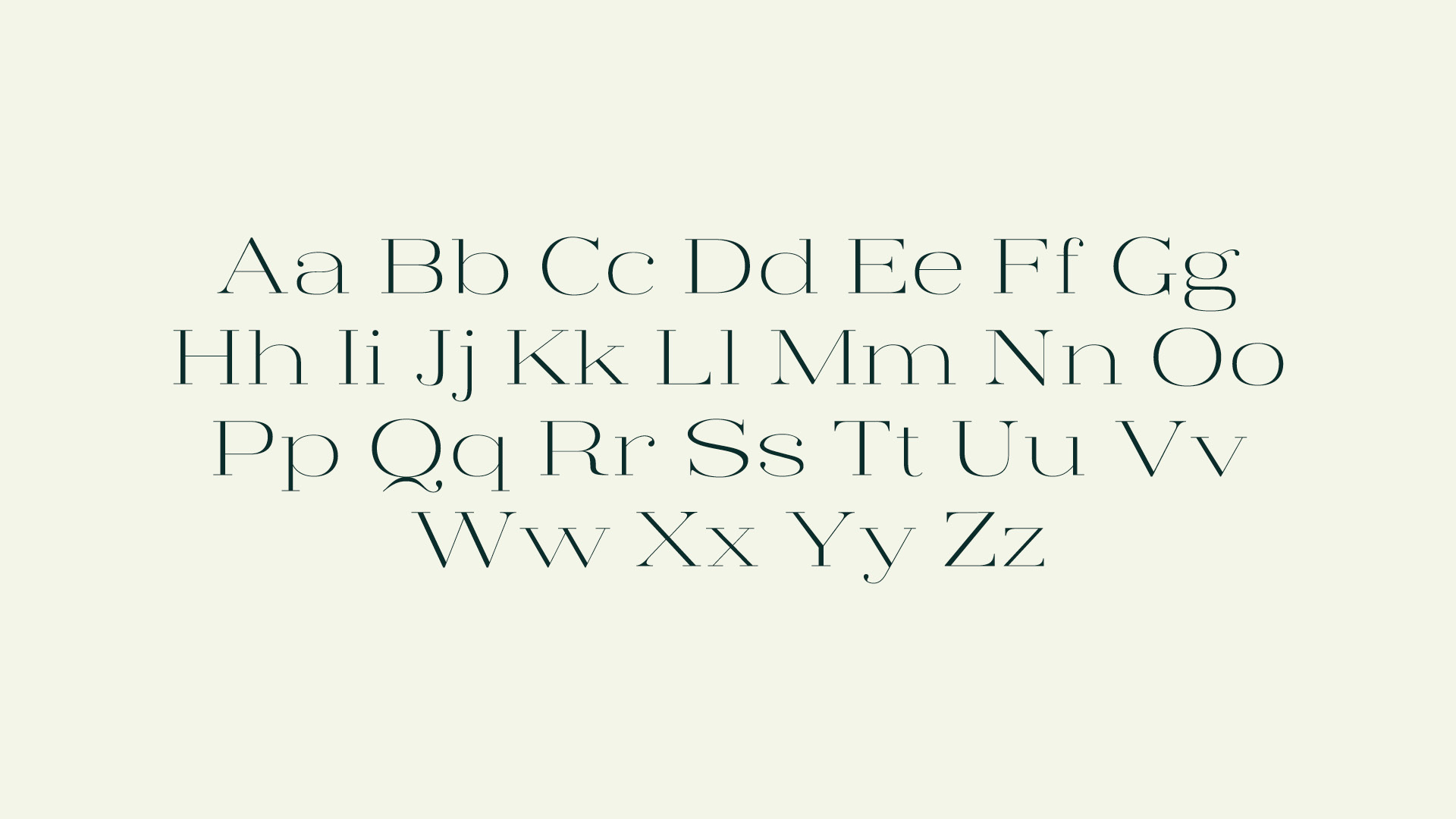
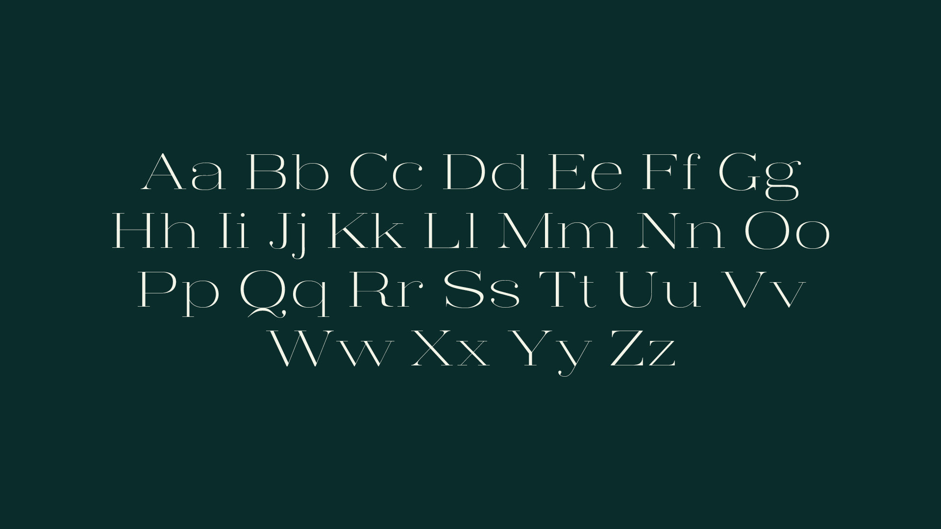
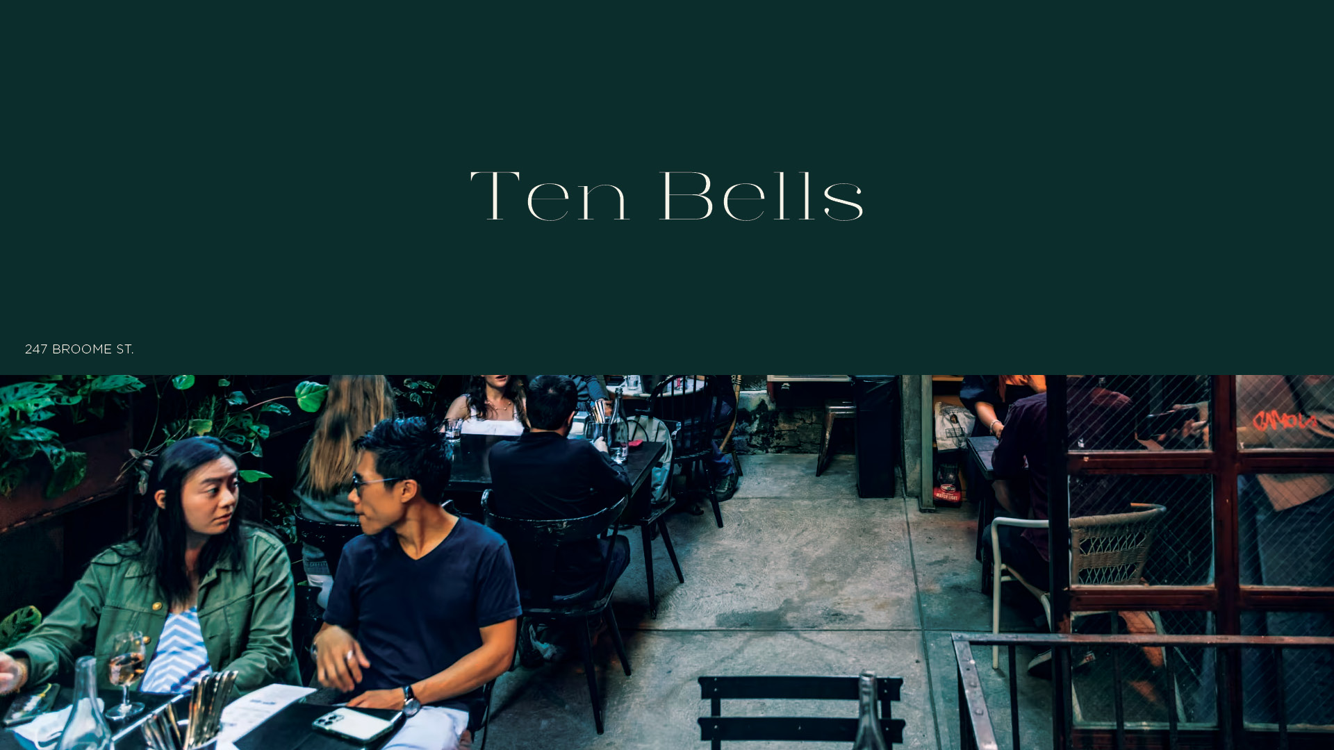
An ongoing project to design a wide, high-contrast display typeface with hairline serifs.
︎︎︎

In designing Contra Light, I was drawn to the challenge of creating a serif that was wider than most in my font book but remained delicate and elegant.
In this first incursion into type design, I held steadfast to the expansion model, carefully balancing hairline widths with thicker strokes. Named after the latin root contra — meaning “against; opposite; contrasting” — high-contrast was always the goal, placing sharp stems opposite soft curvatures.
Details ︎︎︎


